✦Solutions · Analytics

Turn operational data into quality, safety, and compliance insight

Cloudtheapp Analytics helps teams build dashboards, trend dashboards, and drill-down views directly from the digital processes they already run. The result is not just reporting: it is earlier warning, clearer accountability, and faster decisions.

Once workflows, approvals, complaints, deviations, audits, and training records live in one governed platform, the patterns hidden inside that data finally become visible.

Quality trendsSafety oversightCompliance visibilityDrill-down dashboardsExecutive review packs
Analytics command center
Illustrative data
Open CAPAs
46
On-time audit closure
92%
Overdue safety actions
7
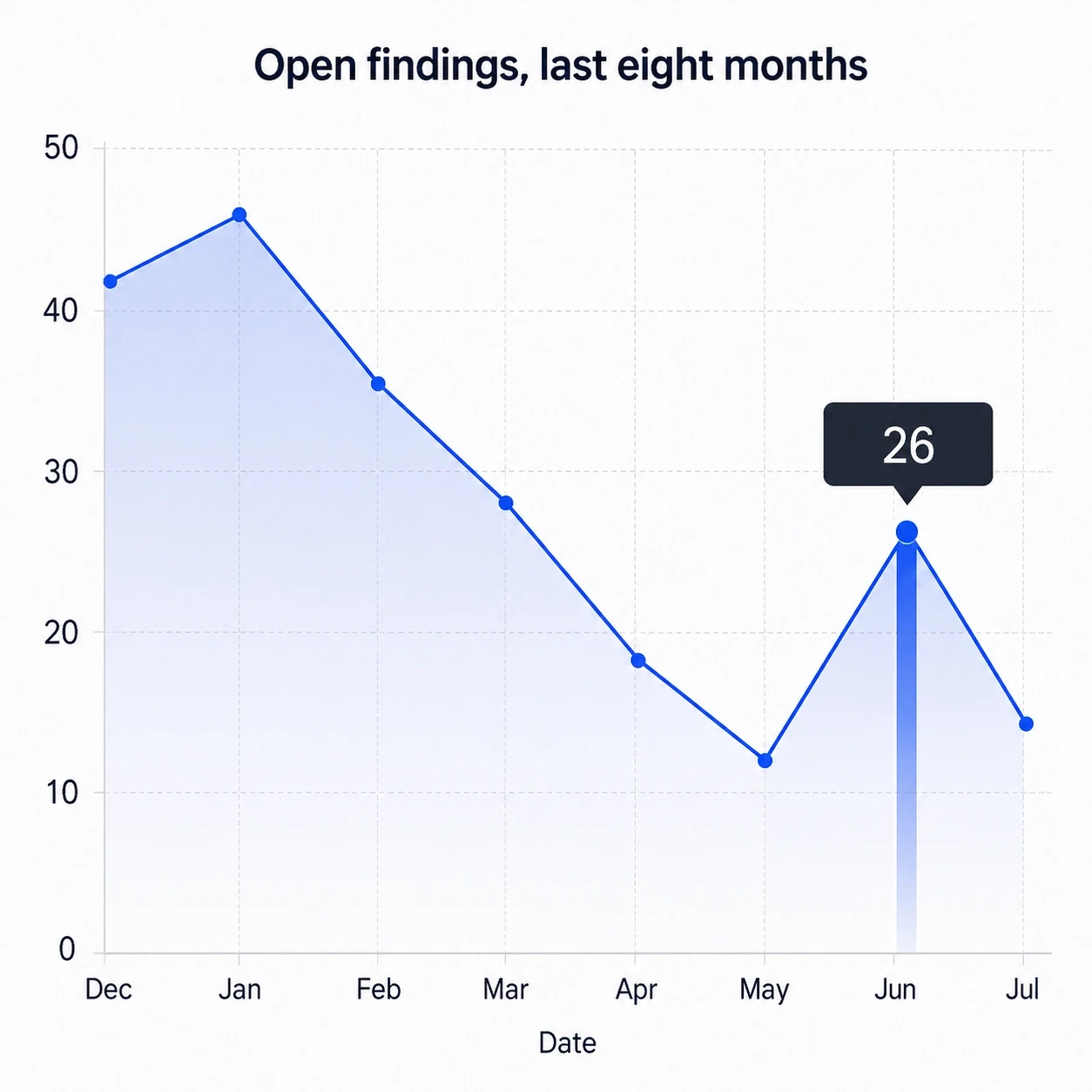
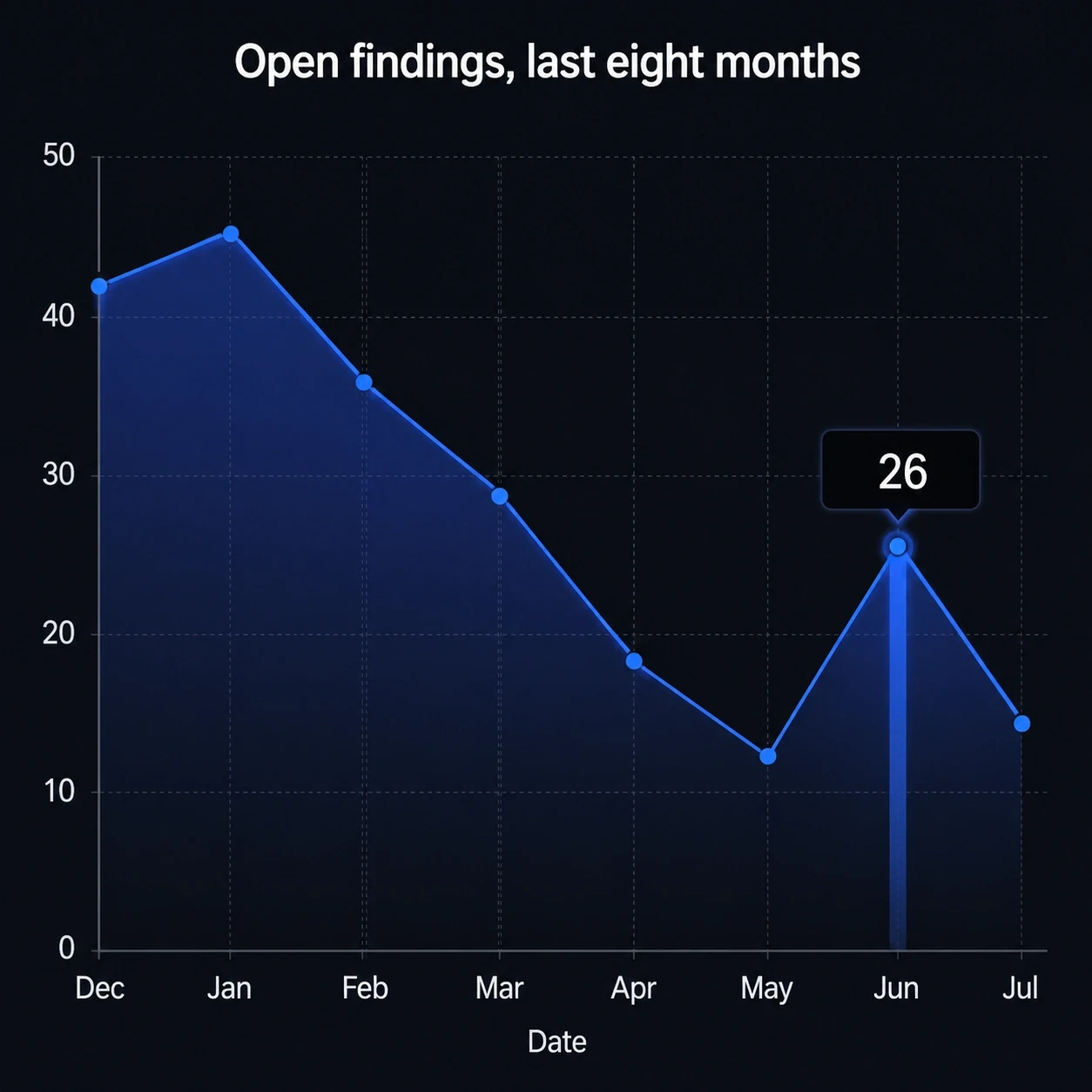
Area chart titled β€œOpen findings, last eight months”, trending down from 42 open findings in December to 14 in July, with a spike back to 26 in June.Area chart titled β€œOpen findings, last eight months”, trending down from 42 open findings in December to 14 in July, with a spike back to 26 in June.
  • Drill from a trend line into the individual CAPA records and their owners.
  • Compare sites, product families, workflows, and severity bands side by side.
  • Build review-ready dashboards without exporting data into another tool.
1
Source of truth
All dashboards pull from governed process data, not spreadsheet snapshots.
1 click
From graph to record
Owner, site, category, date range, and workflow state all come with the records behind the point.
0
Exports to a separate tool
Dashboards read the same live records the workflows write, so nothing is re-keyed to be charted.
Live
Executive review surface
Leadership reads the numbers the process wrote this morning, not last month's extract.
Why digitalization matters

The advantage is not just digitizing the work, but seeing the story inside the data

Once quality, safety, and compliance processes are digital, every approval, finding, delay, retraining event, deviation, complaint, and corrective action becomes structured evidence. Analytics turns that evidence into visibility.

Before

Manual systems hide the pattern

Paper files, email chains, and disconnected spreadsheets make trend analysis slow, partial, and easy to challenge.

  • Leaders review lagging summaries instead of live conditions
  • Root-cause patterns stay spread across folders and tools
  • Evidence gets stitched together under deadline pressure
After

Digital process data becomes intelligence

Every digital workflow step becomes searchable, comparable, filterable, and ready to plot on a dashboard.

  • Monitor risk by site, product, owner, supplier, team, or severity
  • Spot repeat issues sooner instead of waiting for the next review cycle
  • Make corrective action and management review evidence-driven
Impact

Insight becomes an operating advantage

The more processes a team digitizes, the stronger its ability to predict pressure, prioritize action, and prove control.

  • Fewer surprises in audits and executive reviews
  • Better alignment between quality, safety, compliance, and operations
  • Clearer decisions on where improvement effort will matter most
Sample dashboards

Examples of the graphs quality teams can build

These are the kinds of dashboards teams configure to manage quality events, audit readiness, training effectiveness, and corrective action performance.

Quality review dashboard

Combine metrics, charts, and action lists into one weekly or monthly review surface instead of rebuilding static slides every time.

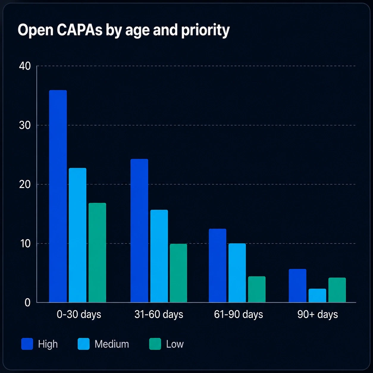
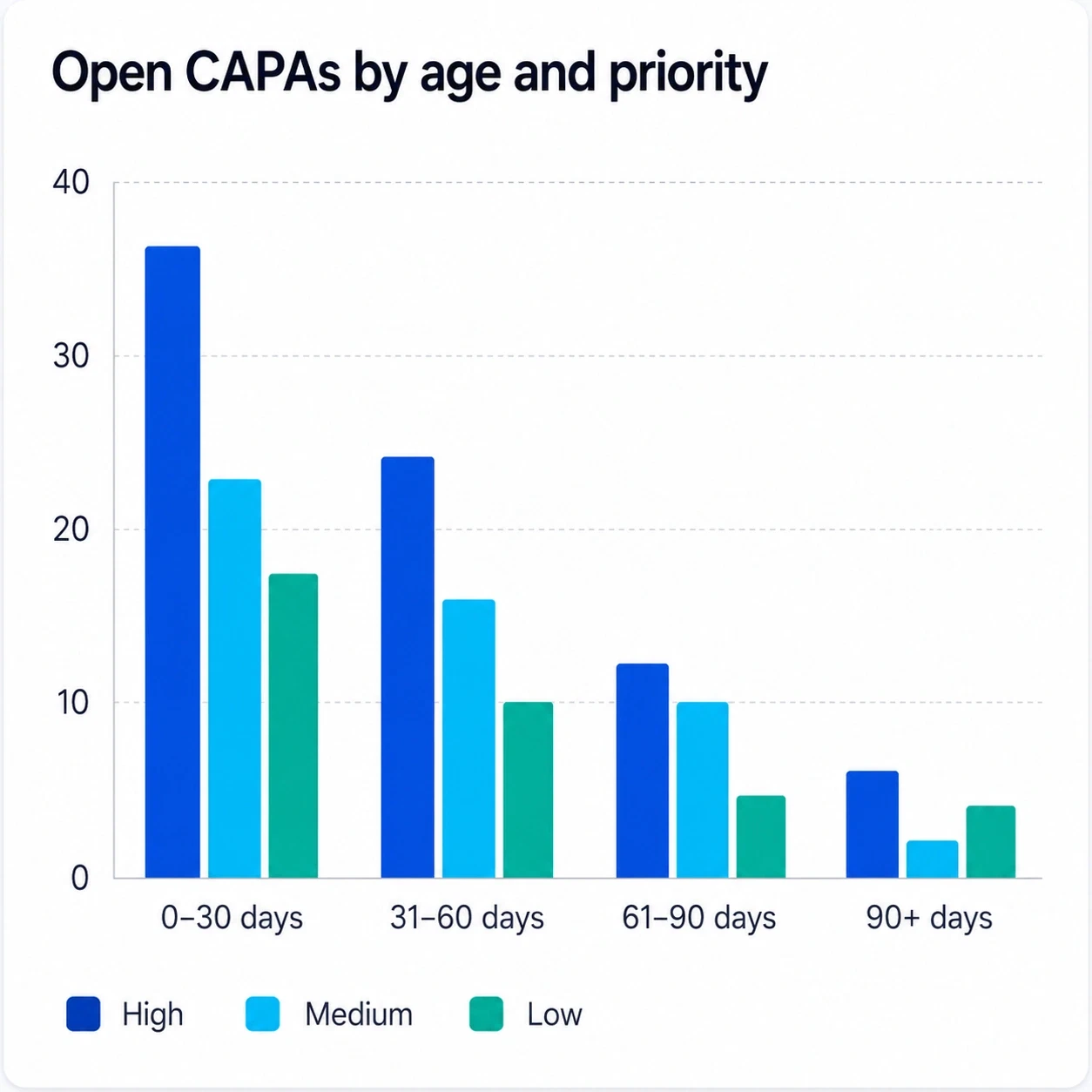
CAPA aging by priority

See whether high-risk actions are closing slower than lower-priority work, and where ownership needs escalation.

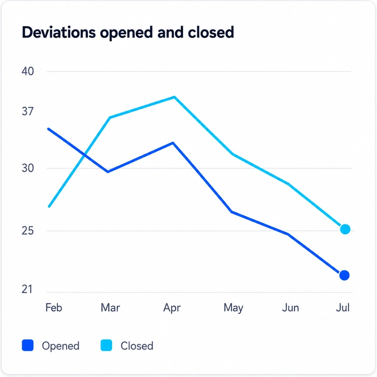
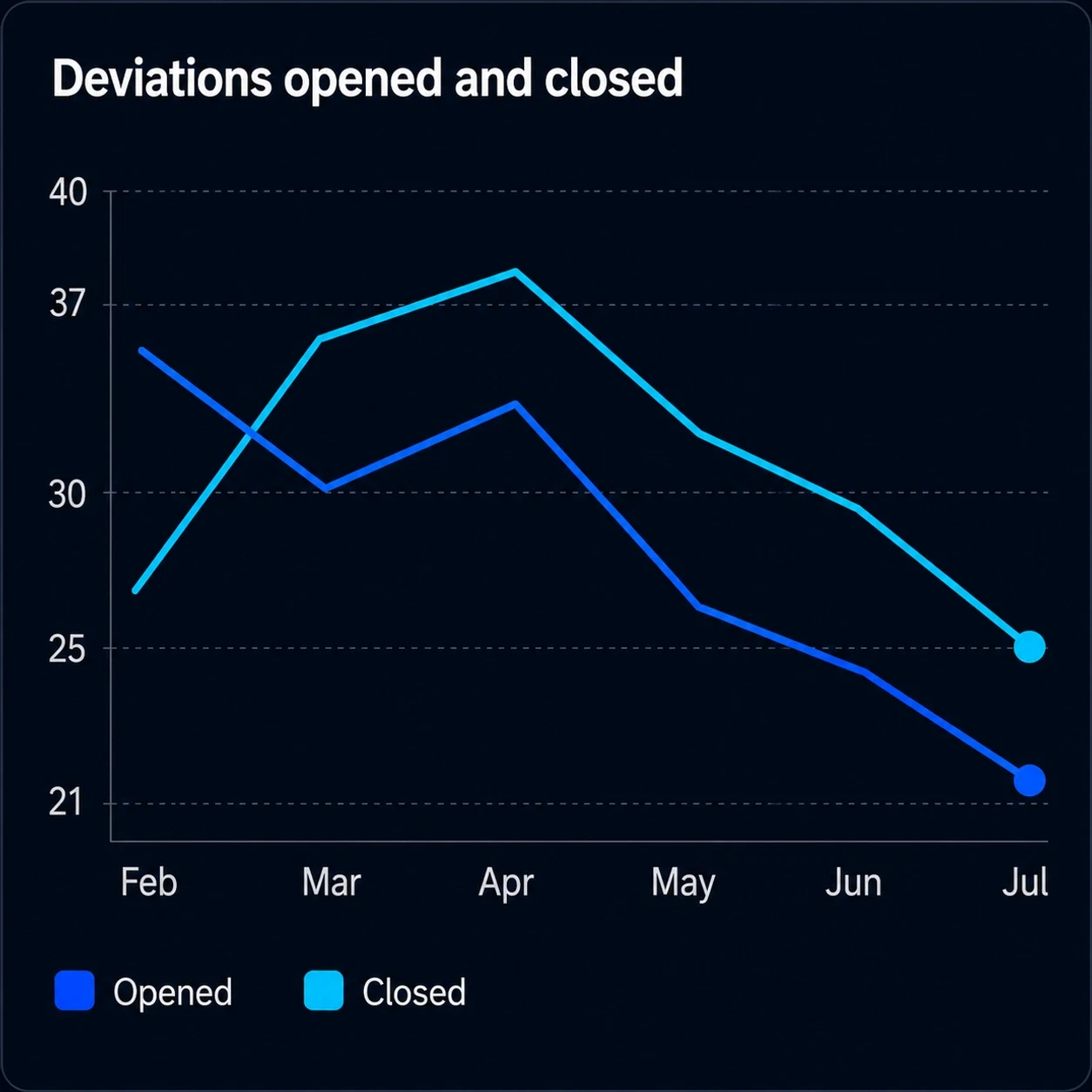
Deviations opened against closed

A falling open count means little if new deviations arrive faster than the team can close the ones already raised.

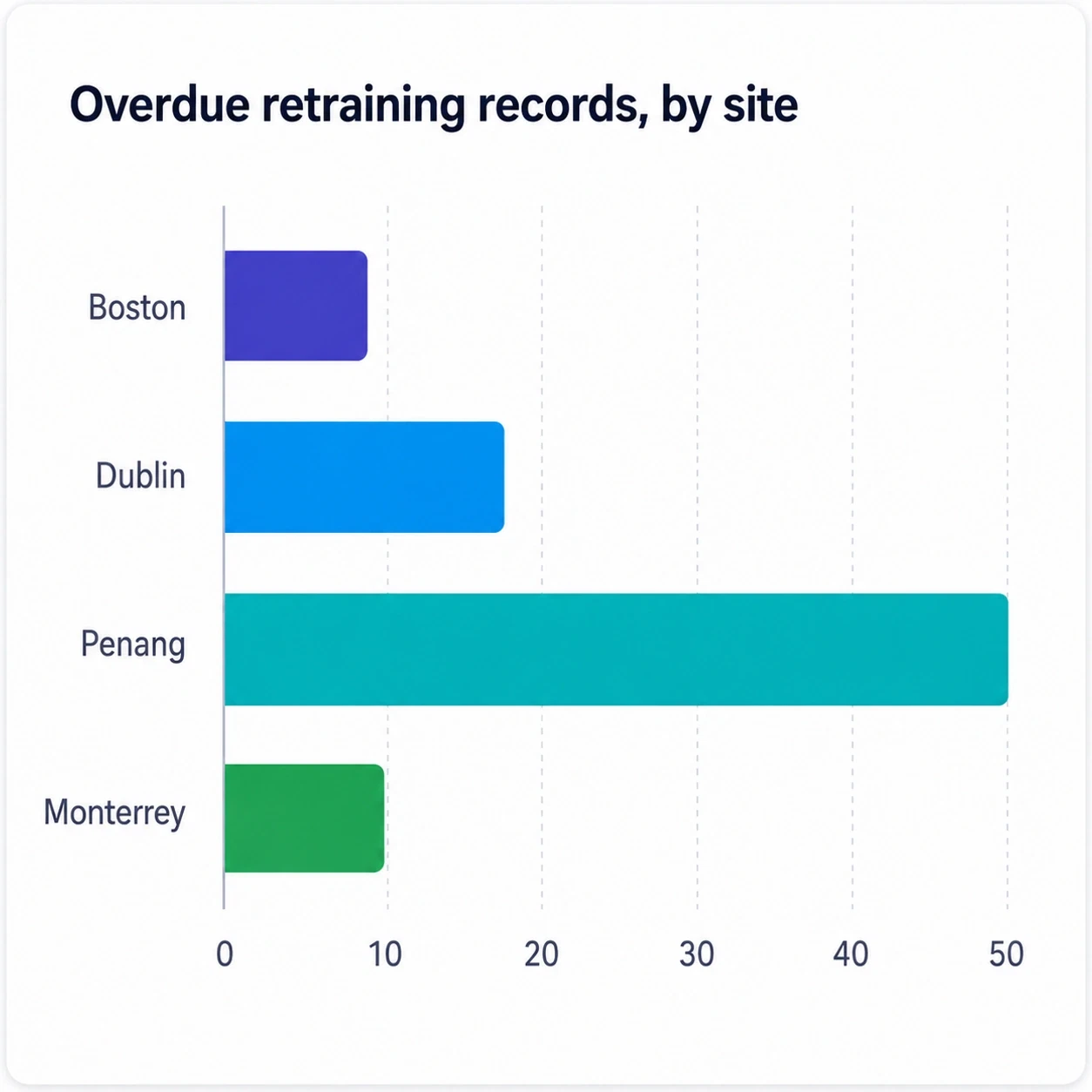
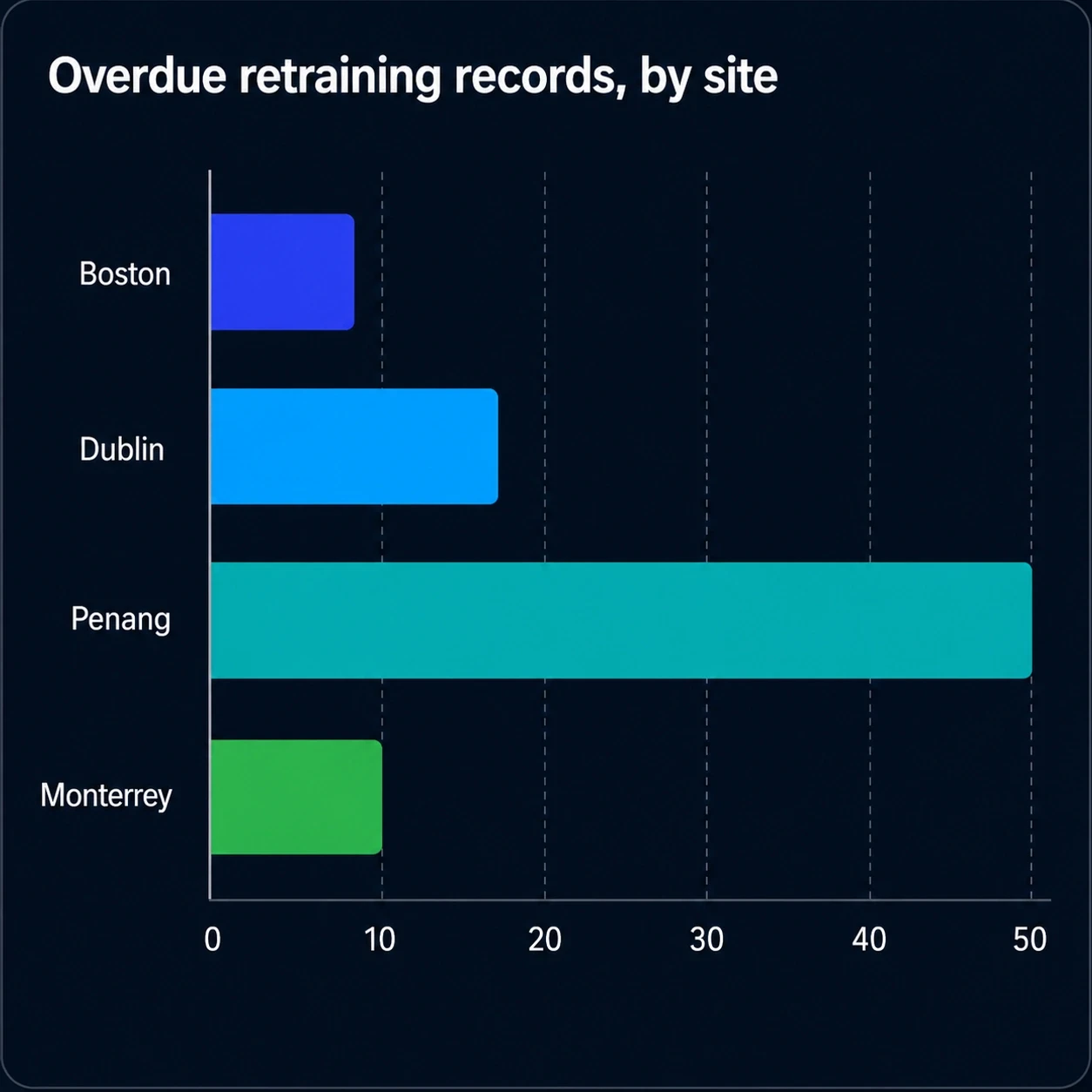
Retraining left open by site

Retraining that never closed after an approved SOP revision is what an inspector finds first, and sites differ.

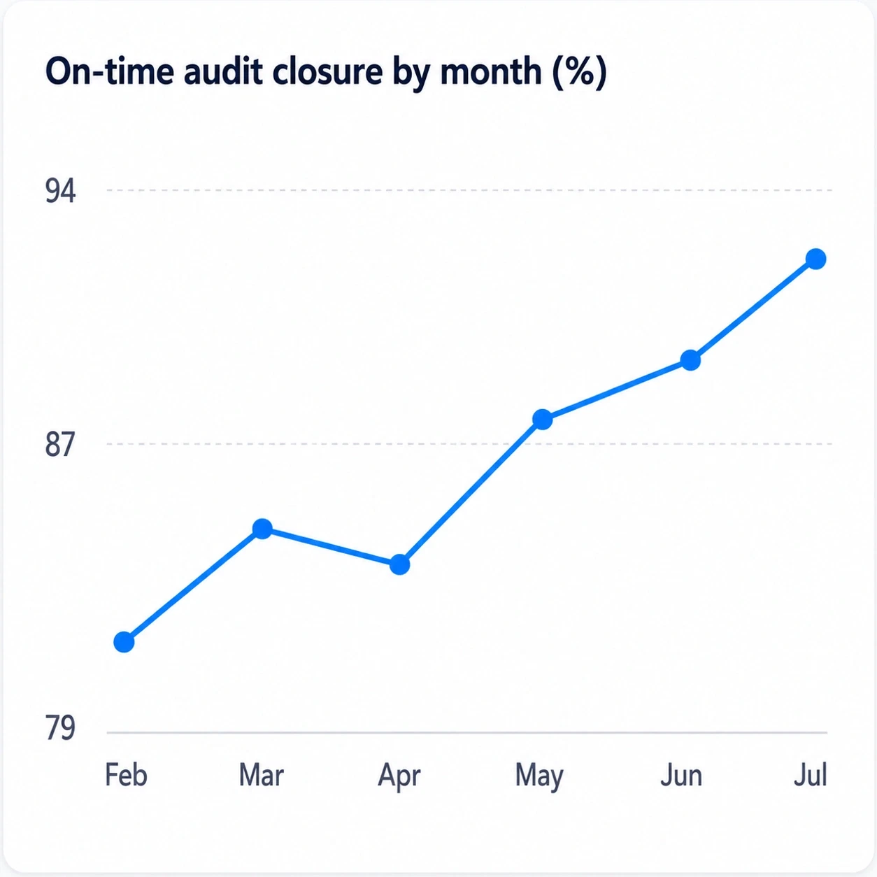
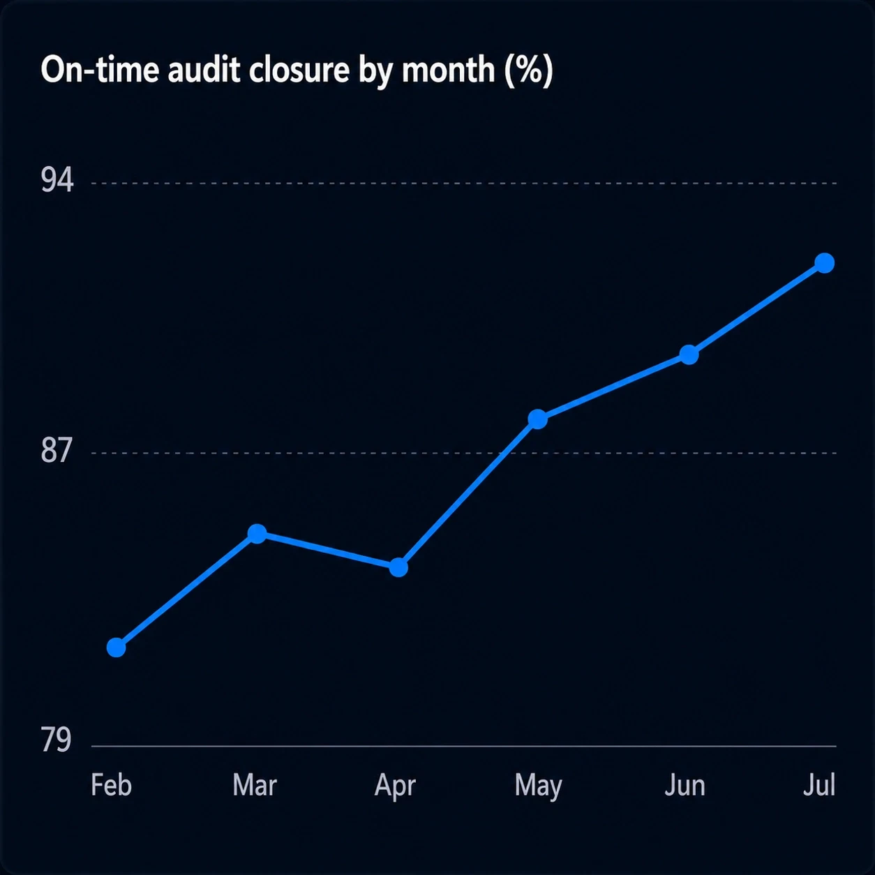
Audit closure, month by month

One rate cannot tell a management review which way the number is moving.

Grouped bar chart titled 'Open CAPAs by age and priority', with high, medium and low priority bars in four age bands. Every band falls as it ages, and high priority is the tallest bar in all four.Grouped bar chart titled 'Open CAPAs by age and priority', with high, medium and low priority bars in four age bands. Every band falls as it ages, and high priority is the tallest bar in all four.
Line chart titled 'Deviations opened and closed', February to July. The closed line crosses above the opened line in March and stays above it, so the backlog falls.Line chart titled 'Deviations opened and closed', February to July. The closed line crosses above the opened line in March and stays above it, so the backlog falls.
Horizontal bar chart titled 'Overdue retraining records, by site'. Penang runs to about 50 records, roughly three times Dublin and five times Boston or Monterrey.Horizontal bar chart titled 'Overdue retraining records, by site'. Penang runs to about 50 records, roughly three times Dublin and five times Boston or Monterrey.
Line chart titled 'On-time audit closure by month (%)', climbing from about 81% in February to about 92% in July after a dip in April.Line chart titled 'On-time audit closure by month (%)', climbing from about 81% in February to about 92% in July after a dip in April.
From graph to record

Click into a chart and the records behind it are already there

A trend is only useful if you can reach what caused it. Open any graph from a dashboard, filter it down to the classification, workflow step, site, or date range you care about, and the record list underneath narrows with it, with subject, owner, and state attached.

  • βœ“Open any dashboard graph full screen, without leaving the platform
  • βœ“Filter by classification, workflow step, site, or date range
  • βœ“The record list narrows with the chart, ready to open
Screen recording of a complaints dashboard. The classification chart opens full screen with a record table beneath it, and switching on the Investigation filter narrows the chart to two classifications and the table from thirteen records to three.
Graph studio

Build dashboards for quality, safety, and compliance without a separate BI project

Teams configure graph sets that match operational reviews, leadership meetings, site oversight, supplier governance, and regulatory readiness programs.

Quality dashboards

Track deviations, CAPAs, complaints, audit findings, retraining completion, NCR patterns, and document-change impact.

  • Complaint trend by product family
  • Deviation recurrence by site or line
  • CAPA effectiveness by root-cause category

Safety dashboards

Monitor incidents, near misses, safety observations, overdue actions, permit patterns, and training compliance.

  • Incident severity trend by area
  • Near-miss reporting health over time
  • Overdue corrective actions by supervisor

Compliance dashboards

Visualize approval timeliness, policy acknowledgements, training evidence, audit readiness, and recurring control gaps.

  • Regulatory commitment due-date tracking
  • Audit readiness by process area
  • Electronic signature completion status
Make it yours

Recolor a whole dashboard in one click, in light or dark

Dashboards get read in different rooms: a wall screen on the floor, a projector in a management review, a laptop in an audit. Pick a palette and every chart on the dashboard follows it at once, so a dashboard stays legible wherever it is shown, and stays on brand while it is.

  • βœ“One palette drives every chart on the dashboard, not one chart at a time
  • βœ“Light and dark themes across the whole platform
  • βœ“The choice sticks to the dashboard, so a review always opens the same way
Screen recording of a complaints dashboard. A color palette opens and a new color is chosen, and the area chart, stacked bars, step cards, and donut all recolor together.Screen recording of a complaints dashboard. A color palette opens and a new color is chosen, and the area chart, stacked bars, step cards, and donut all recolor together.
Visual examples

Dashboards built for supplier, document, and risk reviews

The same chart set covers supplier governance, document operations, and enterprise risk, without leaving the platform that holds the records.

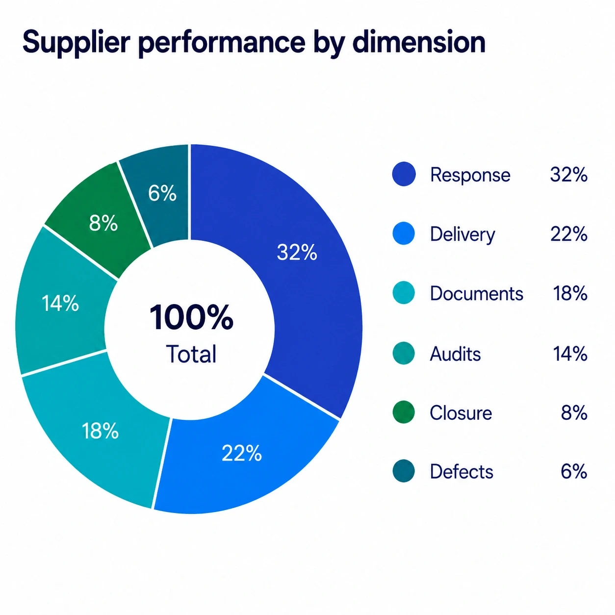
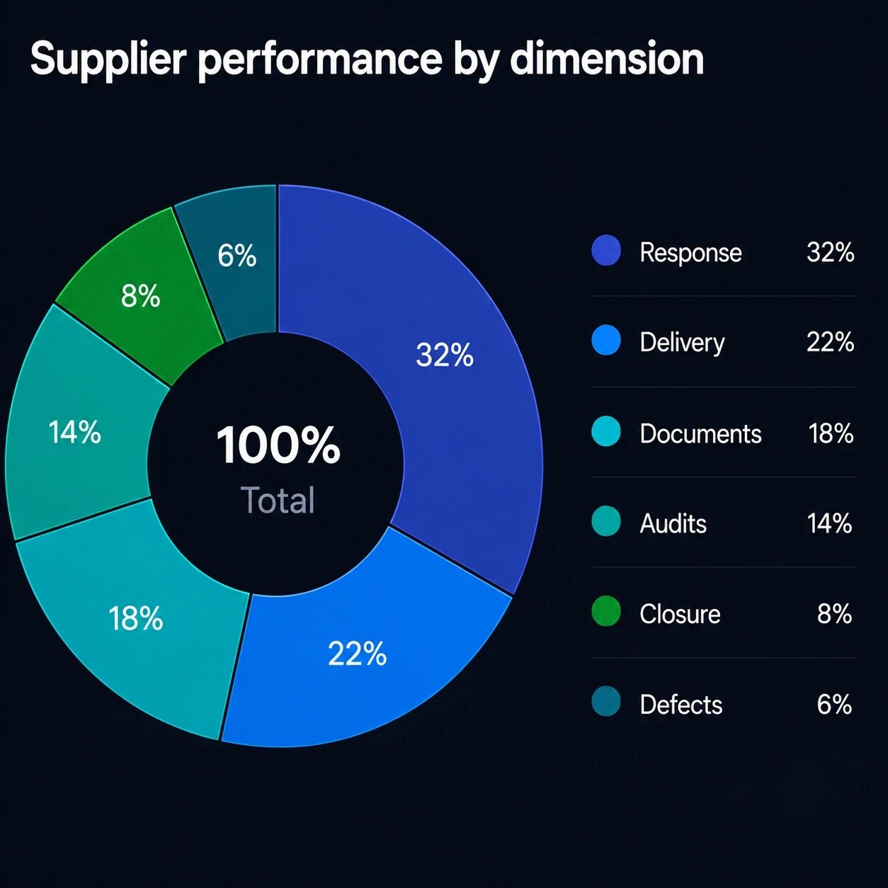
Donut chart titled 'Supplier performance by dimension', totalling 100%: response 32%, delivery 22%, documents 18%, audits 14%, closure 8%, defects 6%.Donut chart titled 'Supplier performance by dimension', totalling 100%: response 32%, delivery 22%, documents 18%, audits 14%, closure 8%, defects 6%.

Supplier quality scorecard

Weigh where supplier performance is actually won and lost, across response speed, delivery, documentation, audits, closure quality, and defects.

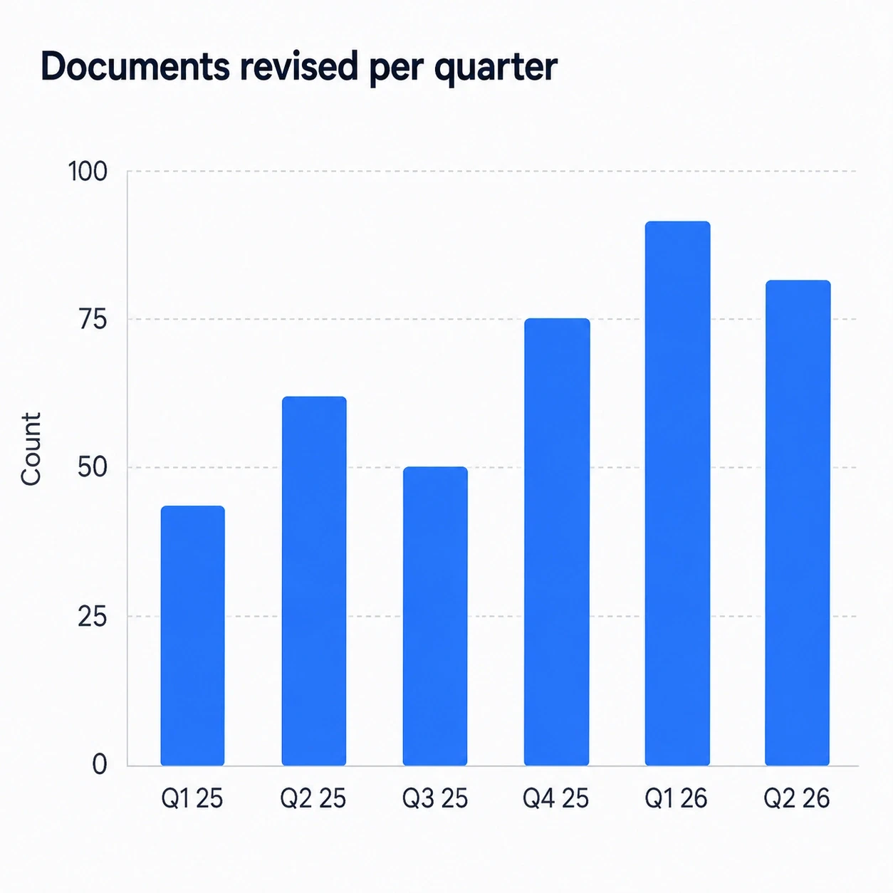
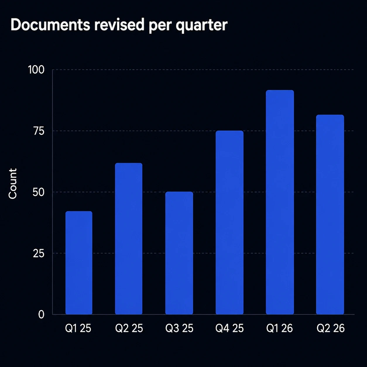
Bar chart titled 'Documents revised per quarter', rising from about 42 in Q1 2025 to a peak of about 91 in Q1 2026, then easing to 81 in Q2 2026.Bar chart titled 'Documents revised per quarter', rising from about 42 in Q1 2025 to a peak of about 91 in Q1 2026, then easing to 81 in Q2 2026.

Document revision velocity

See whether document changes are accelerating because of growth, a new regulation, or corrective activity.

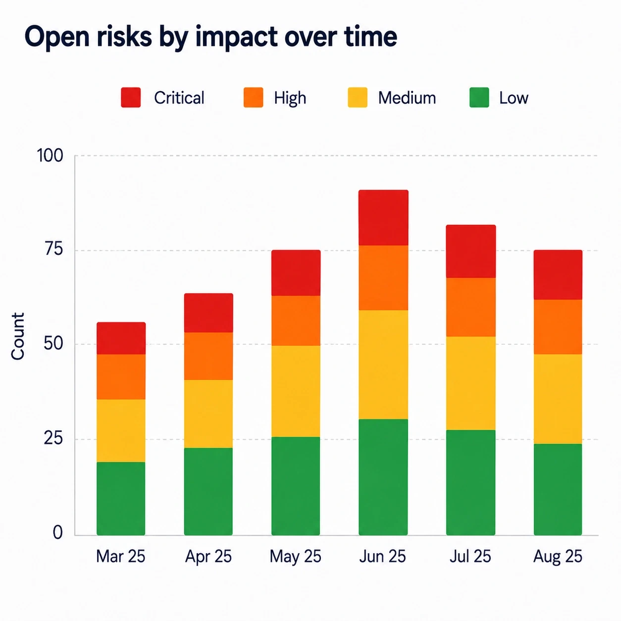
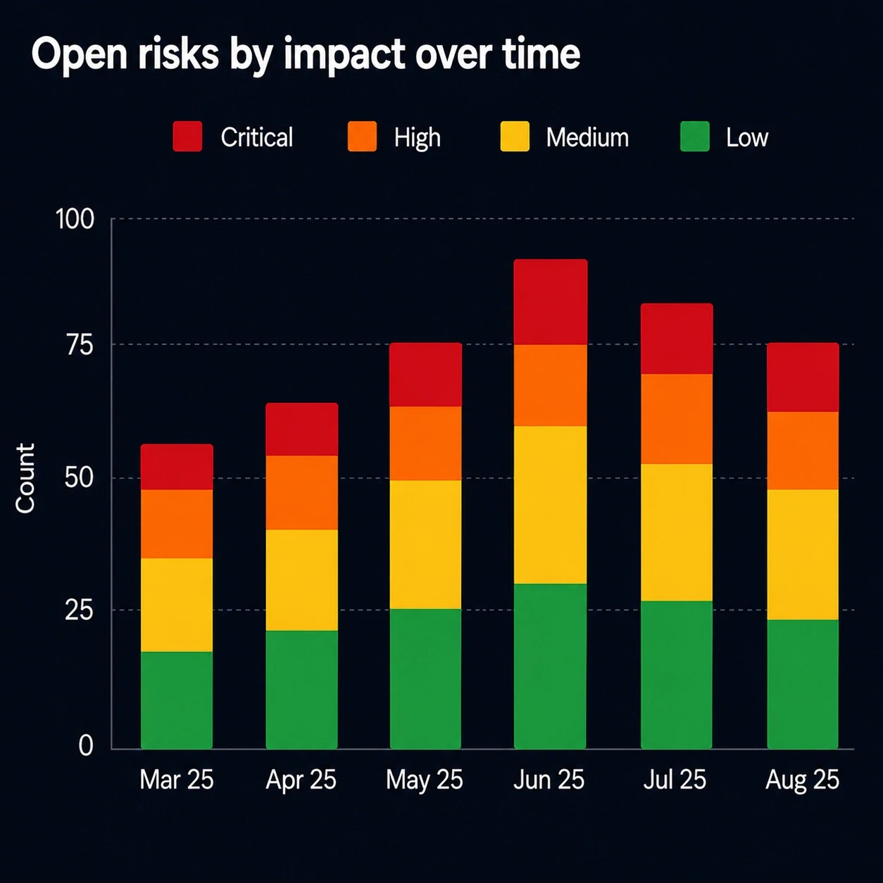
Stacked bar chart titled 'Open risks by impact over time', March to August 2025, split into critical, high, medium and low bands. The total peaks at about 92 in June and falls back to 75 by August.Stacked bar chart titled 'Open risks by impact over time', March to August 2025, split into critical, high, medium and low bands. The total peaks at about 92 in June and falls back to 75 by August.

Risk profile over time

Watch the open risk pool move month by month, and whether the growth is in the critical and high bands or only in the ones you can live with.

Adoption journey

How teams usually grow into analytics maturity

Most customers start with a few operational review dashboards, then expand into broader performance and compliance intelligence.

  1. 01

    Digitize

    Move paper and spreadsheet processes into governed workflows, so usable data starts accumulating on its own.

  2. 02

    Visualize

    Build charts around the KPIs that matter most for operational health, audit readiness, and performance management.

  3. 03

    Drill down

    Connect a top-level metric to the records underneath it, so the team can explain why a graph moved, not just that it moved.

  4. 04

    Act faster

    Use live visibility to prioritize corrective action, allocate resources, and catch risk trends earlier.

Frequently asked questions

Questions buyers ask about analytics

Business users configure dashboards and graph views around the workflows and fields they already manage. There is no data warehouse to stand up and no report developer in the loop for routine dashboards.

Because once a process runs digitally, every step becomes measurable. Approvals, delays, findings, retraining, and closures all arrive as structured records, which is exactly the evidence a chart needs. Scattered manual records cannot produce that, whatever tool you point at them.

Yes. A trend line, a bar, or a slice traces back to the individual records behind it, and the filters that shaped the dashboard still apply once you are there. That is what turns a graph from a talking point into an action list.

Yes. One dashboard can summarize operational health, risk trends, overdue actions, compliance status, and improvement performance, so a management review opens a live page instead of a deck someone assembled the week before.

No. The same model covers safety, compliance, supplier management, document operations, and broader business control processes. Every application on the platform writes records the same way, so any of them can be charted.

Get started

See how Cloudtheapp turns your process data into operating insight

Bring a quality, safety, or compliance workflow into one governed digital model, then surface the dashboards that help your team act sooner.

πŸ“Š Quality insightπŸ›‘οΈ Safety visibilityβœ… Compliance confidenceπŸ”’ 21 CFR Part 11